
PanicApp
User Research
UX Design
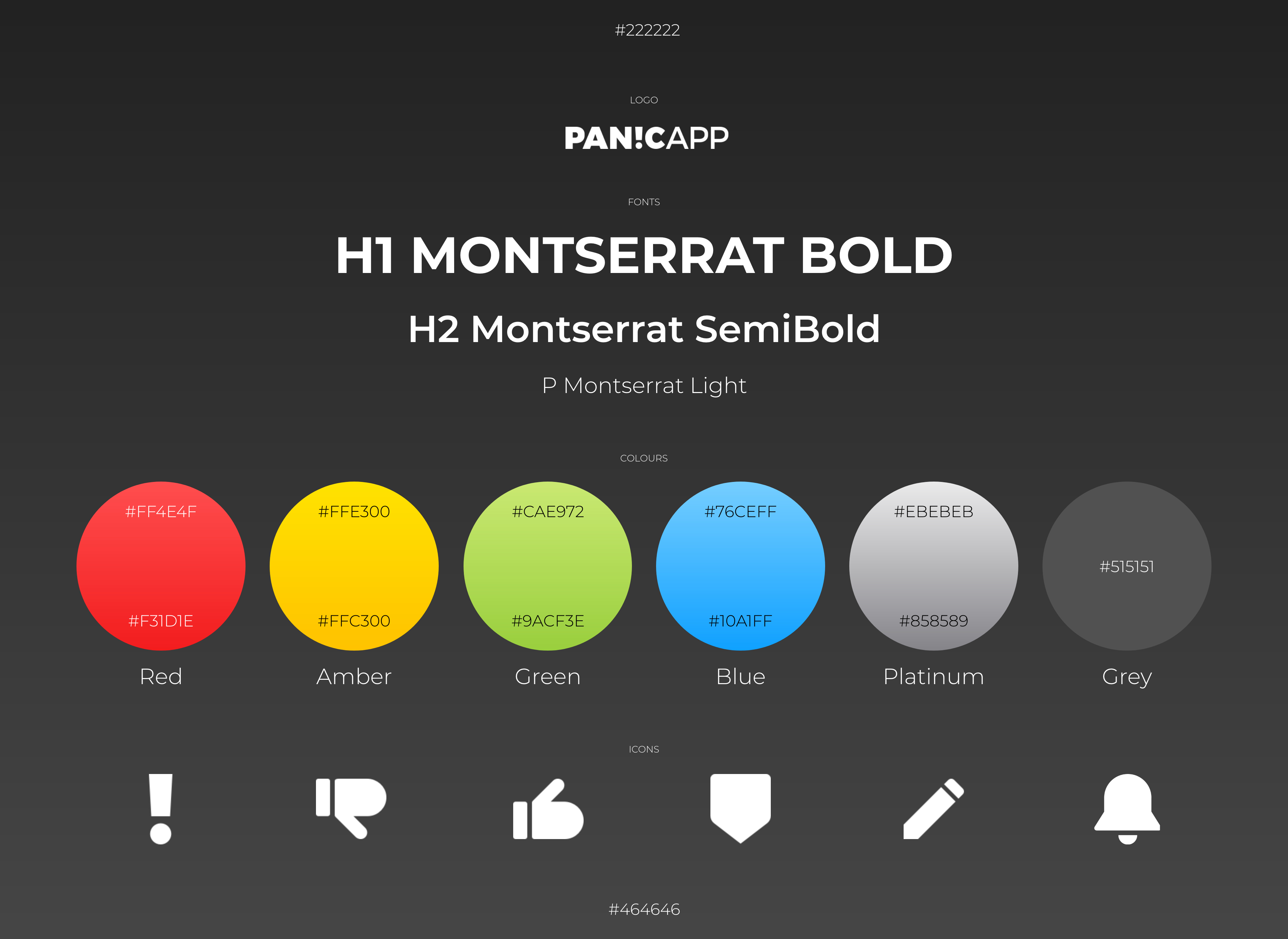
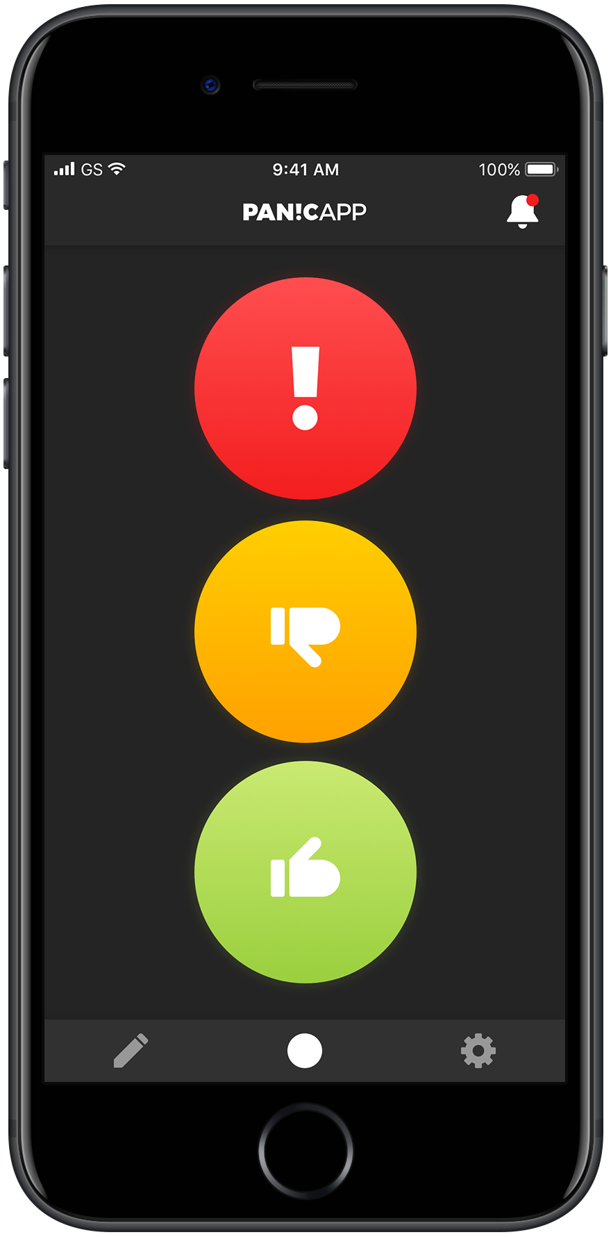
UI Design
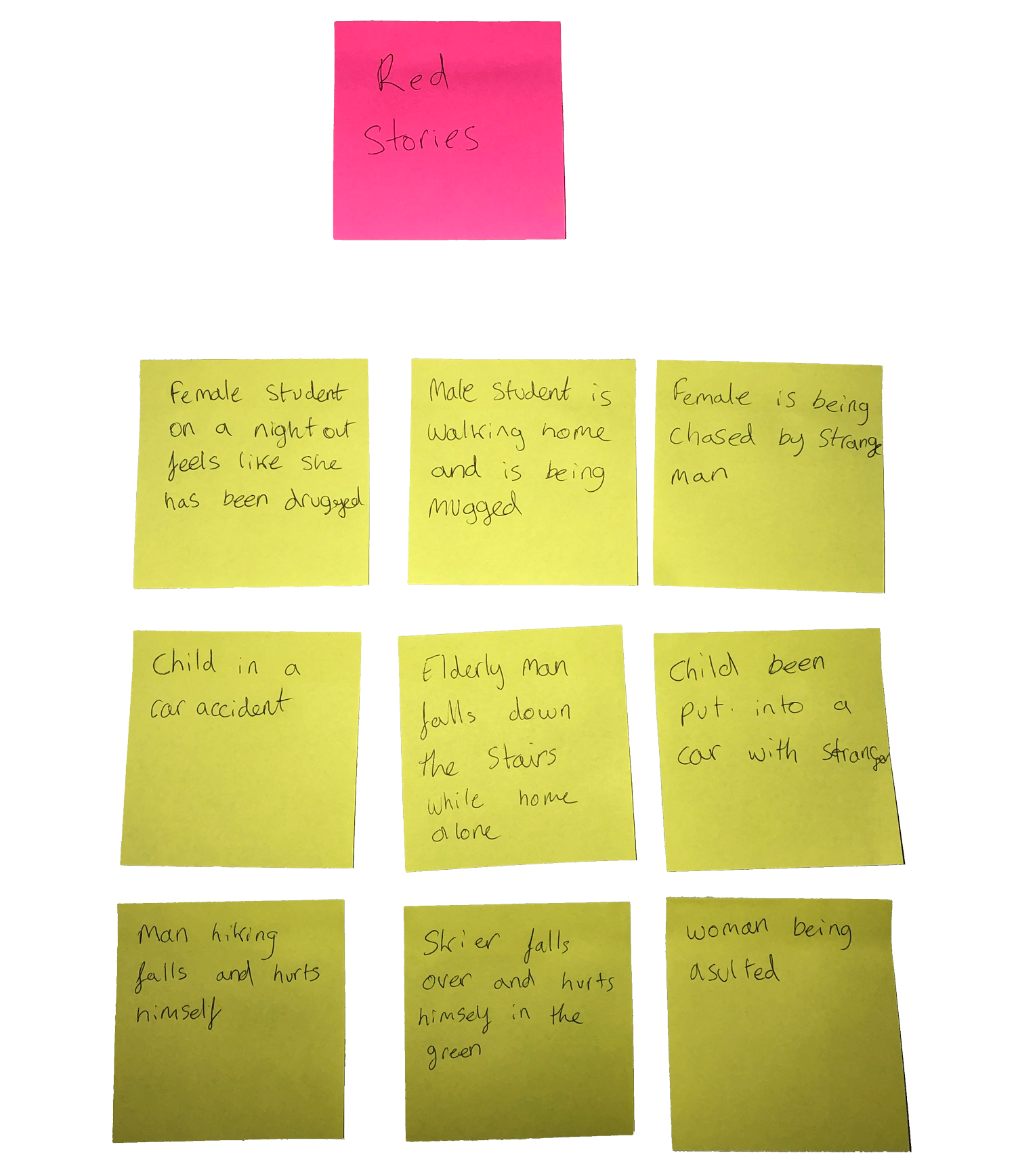
The brief was to create a mobile application that sends panic alerts to emergency contacts. The aim was to send alerts in as few taps as possible. Stakeholders also wanted a user journey that could be repackaged to suit several scenarios down the line; dates, skiing, care homes, school trips.

A report was conducted into the current personal safety apps and services. Each app was categories based on their approach and user interaction. Members of the team tested each app out and reported their findings to me. This allowed us to test which types of interaction worked well and which did not.

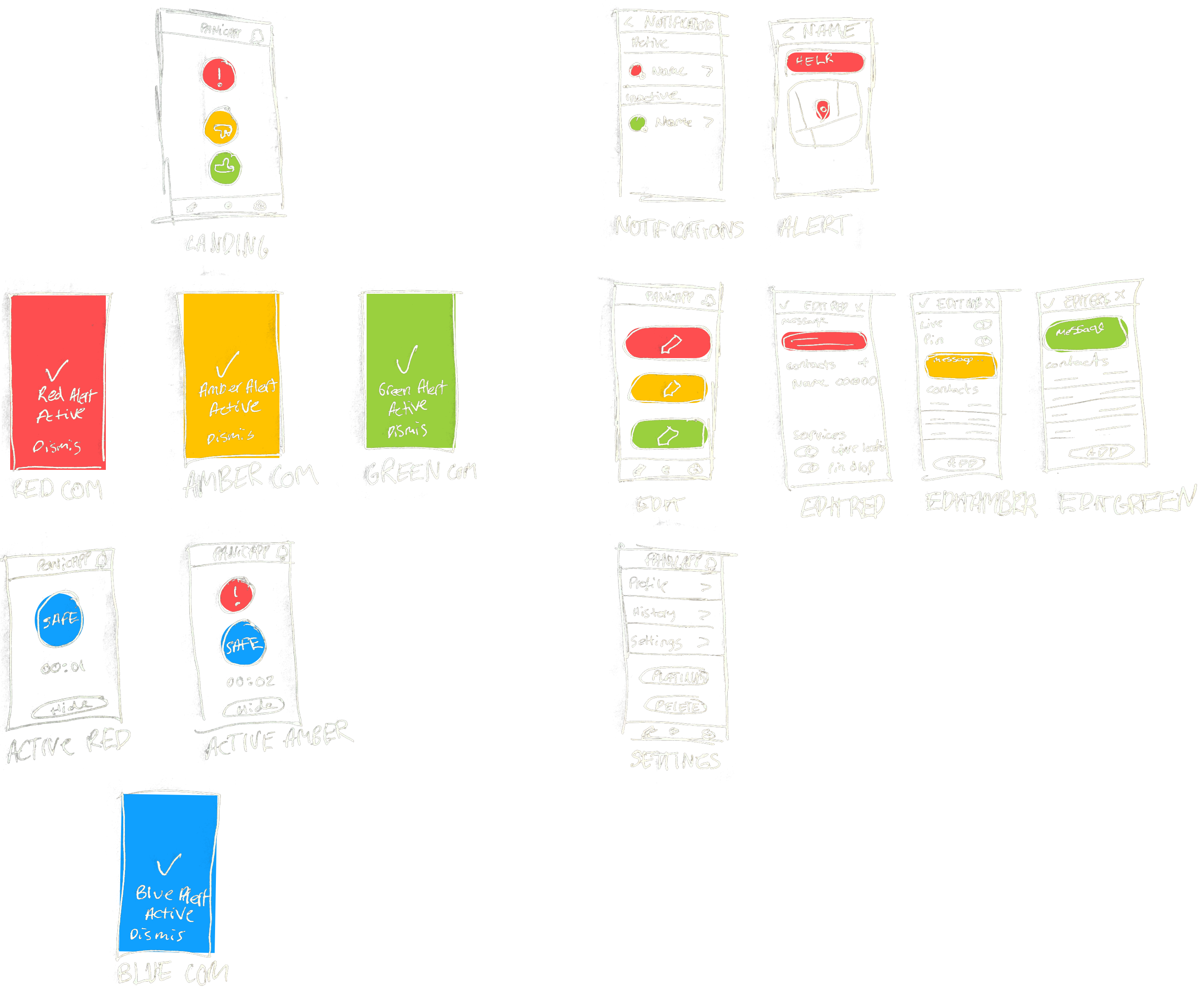
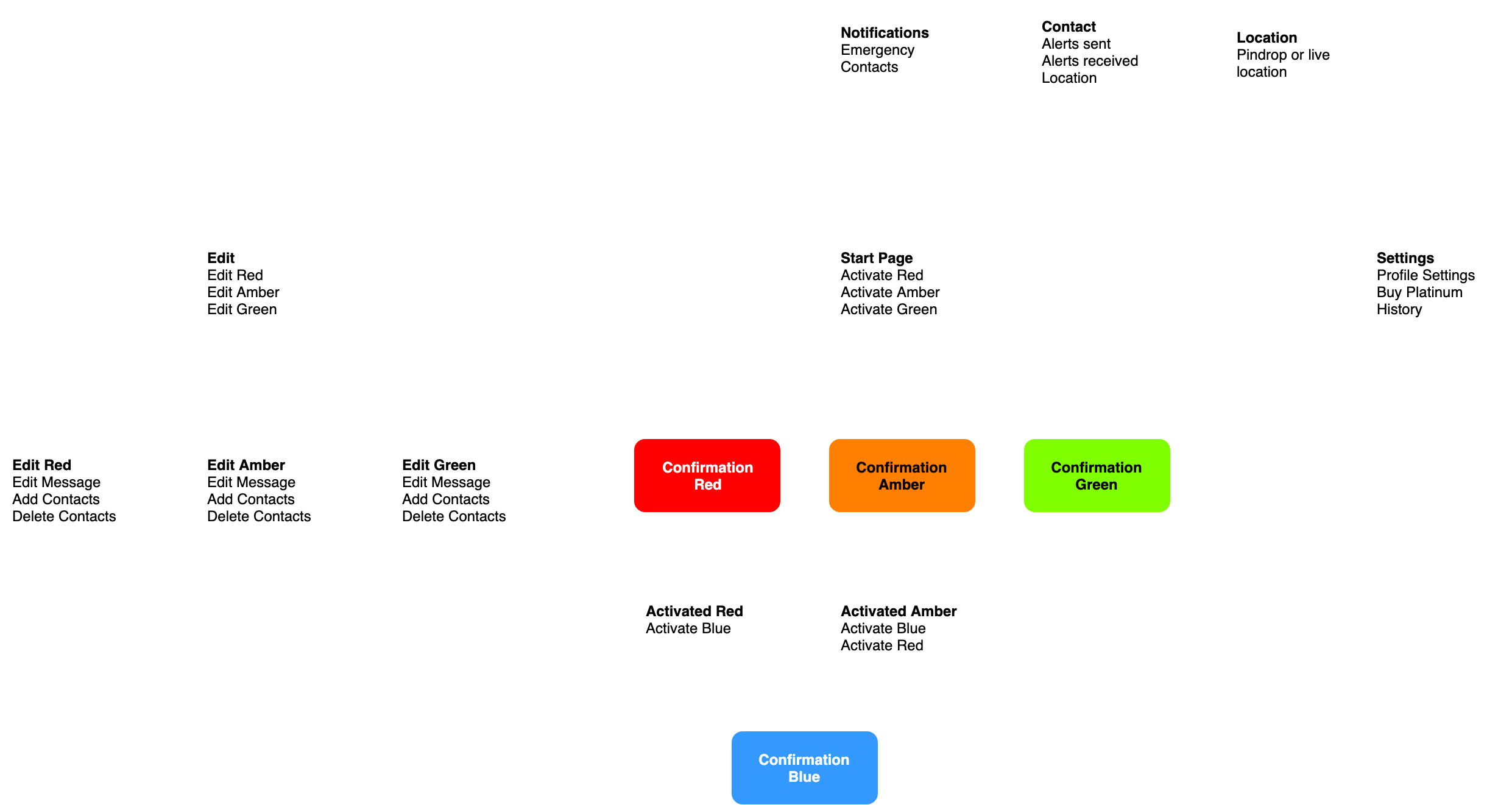
Wireframes were created based on the system requirements of the MVP. These helped the developer build the functionality to fit the user journey before final designs were being created.
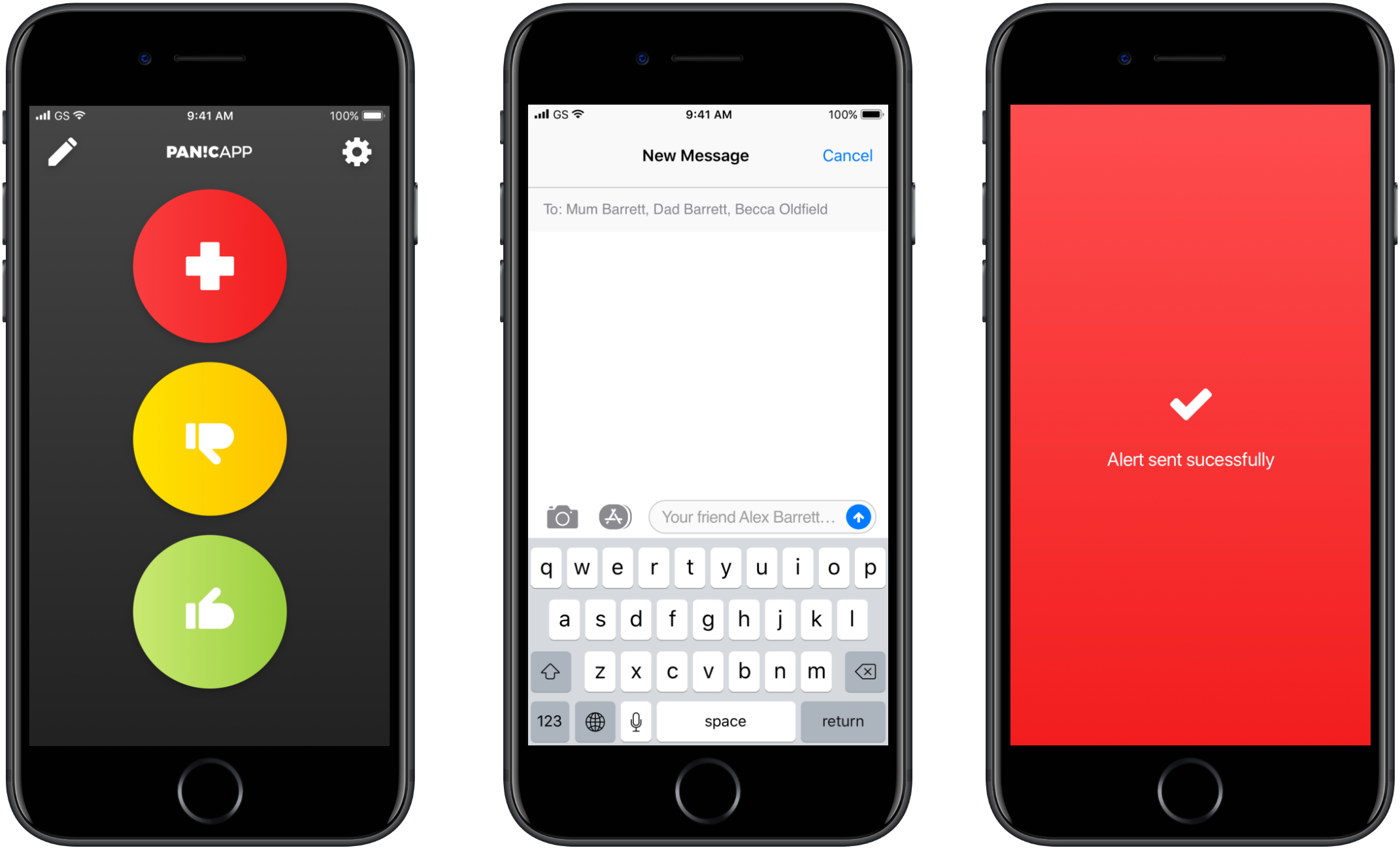
The MVP was used as a proof of concept for stakeholders.
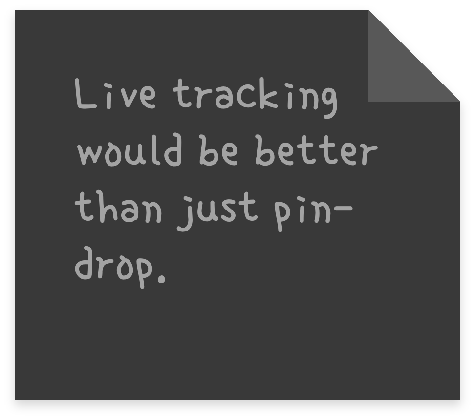
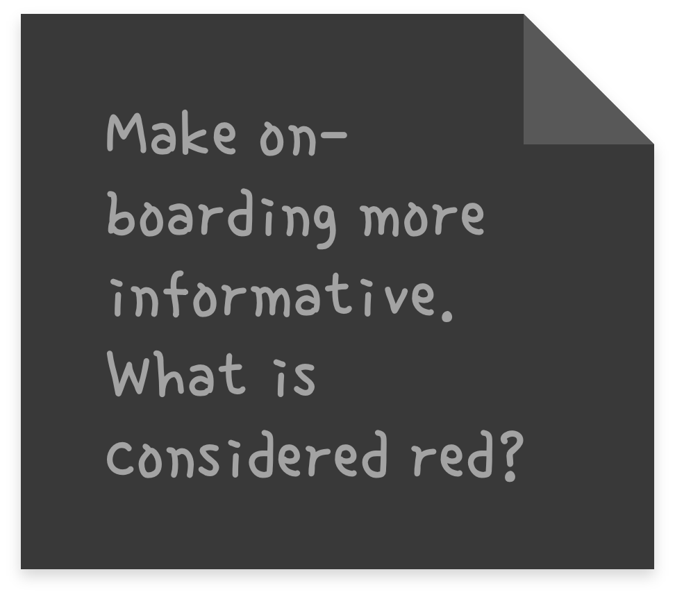
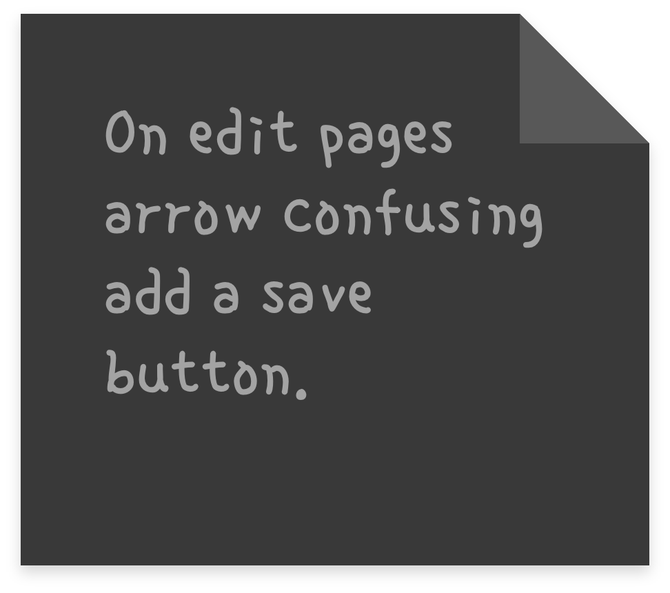
The MVP was distributed to stakeholders and test audiences for feedback. They were encouraged to submit feedback via a form in the app settings. Feedback was used to improve the design in the next iteration.
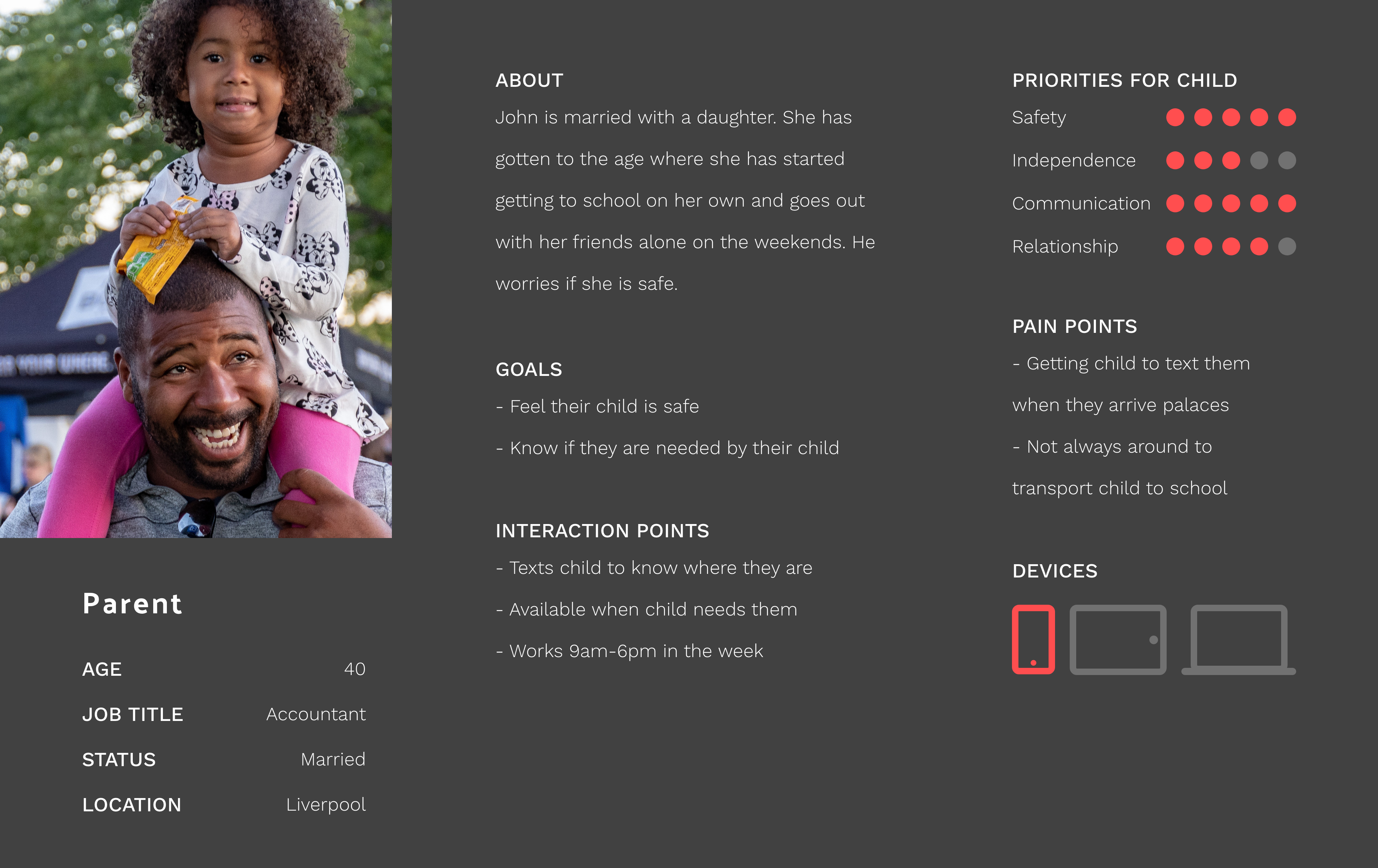
Parent
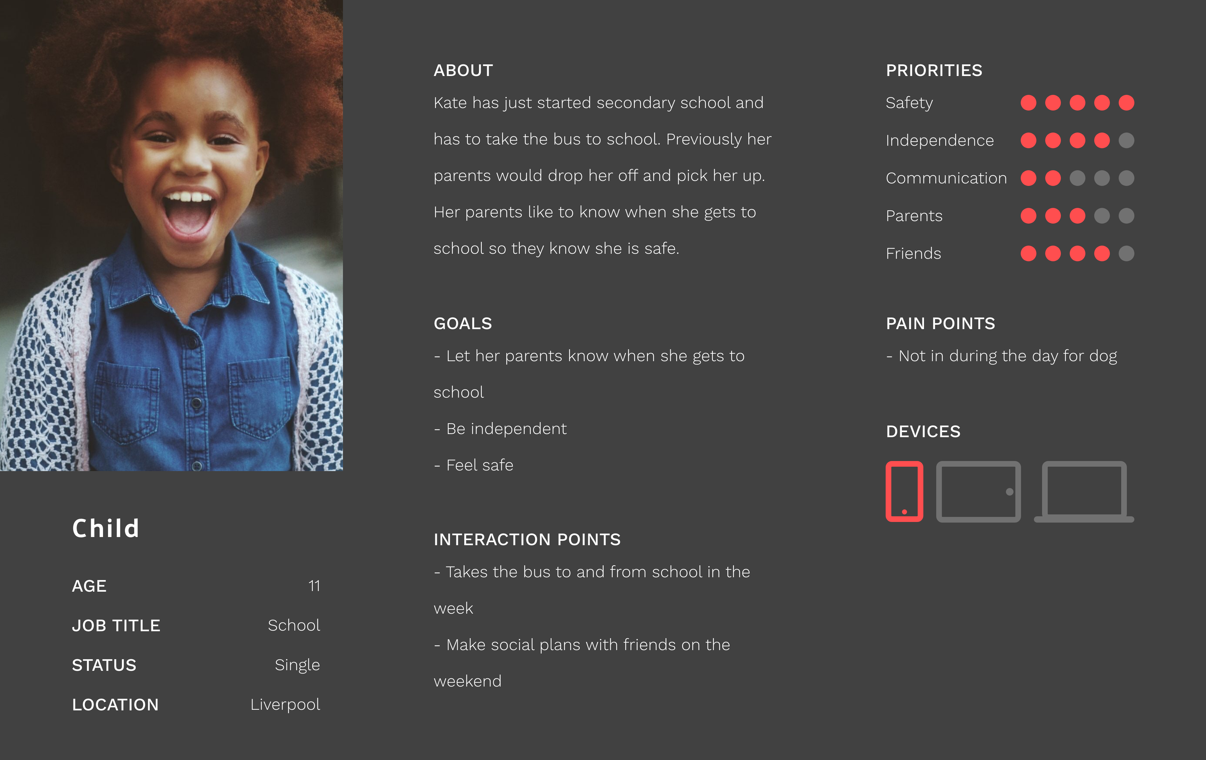
Child
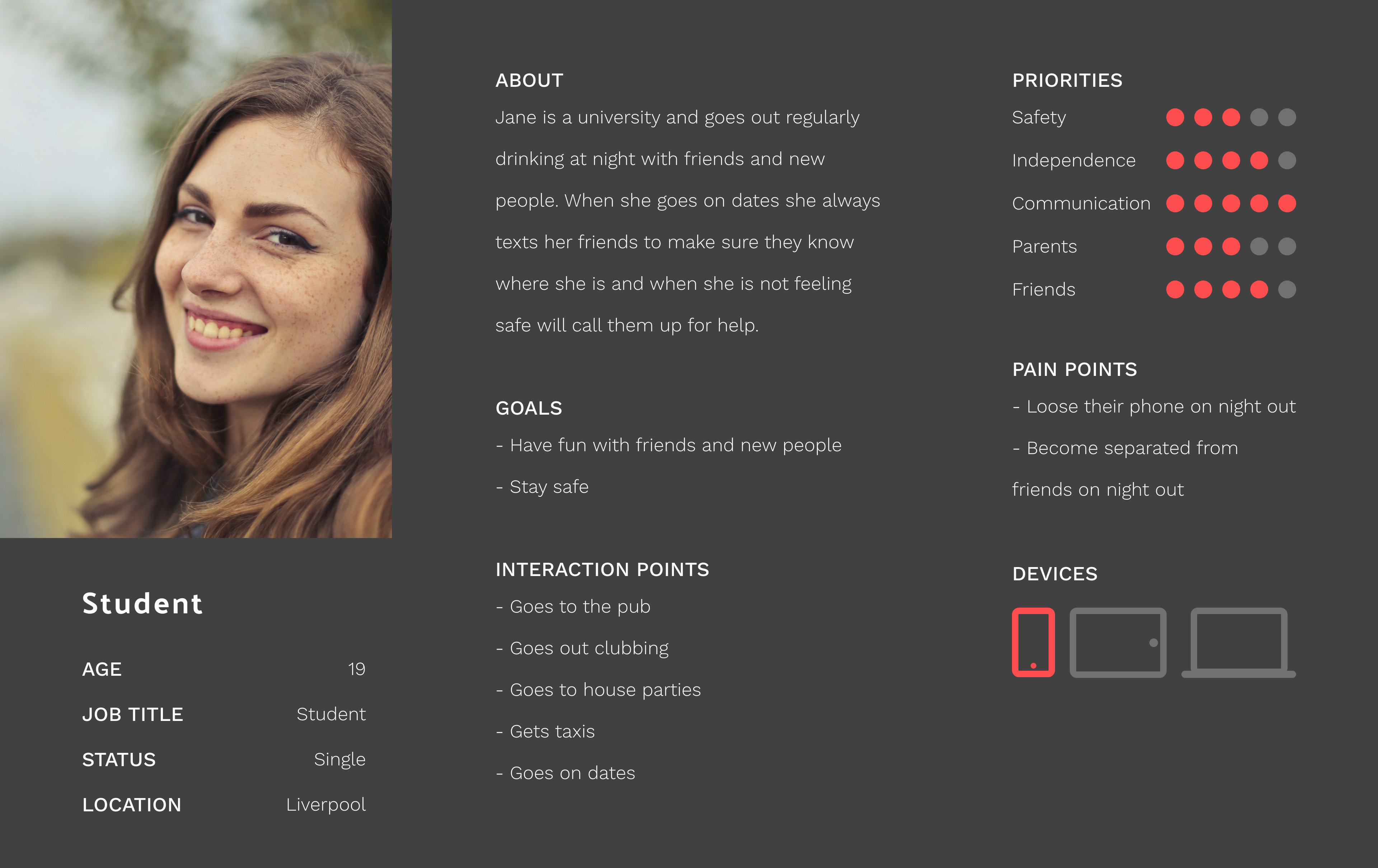
Student

Parent

Child

Student
