
Lomax
User Research
UX Design
UI Design
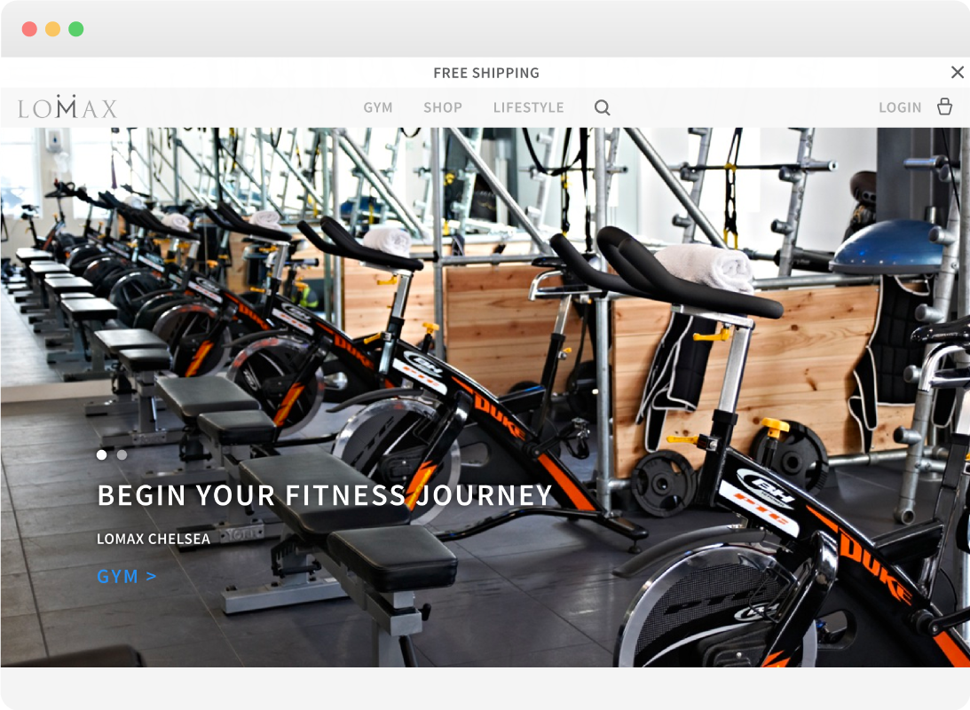
The luxury Chelsea gym brand ‘Lomax’ had two websites, a eCommerce for protein product line and an online booking system for the gyms. The brief was to combine the sites and un-muddy their online presence. The site needed to be designed to push three user goals; book a class, buy a product and engage with brand (by visiting blog and social media).
Once the site was created we took a data insight focused approach to making updates to the site and improve conversion rates. We improved the conversion rate of the site by 30% in the three months after launching the new website.

We begun our research by conducting a focus group with the Lomax brand ambassadors to gain insight into customers the site would be engaging with.

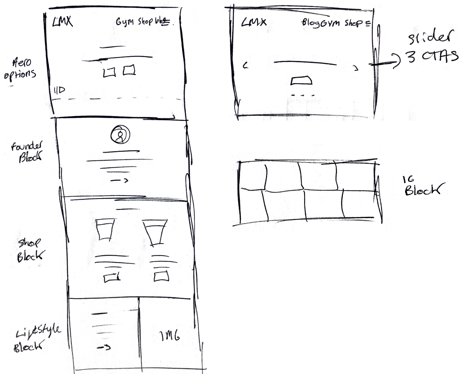
Landing Page
The site was sketched out in a session with the client. This helped us gain better insight into their business requirements and digital goals.

Service Pages
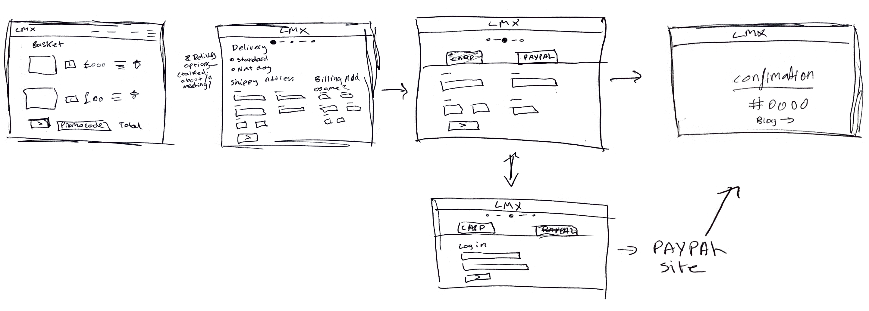
Checkout Pages
Wireframes were created and formed the first prototype. This prototype was used to map out the user journey.
Checkout Pages
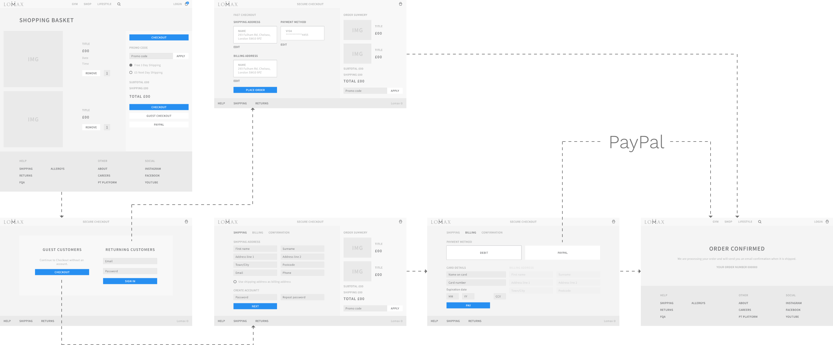
A final high fidelity prototype was created to be presented to the client and for the developers to work from.